Now I get it!
This article is a quick summary of a basic design course. It addresses a simple question: How do you design interactive systems that are easy to understand? Well, it all comes down to two things: structure and process.
Step 1 — Structure: What’s there?
Whenever we look at something we interpret what we see. Looking at the world around us is an active process.
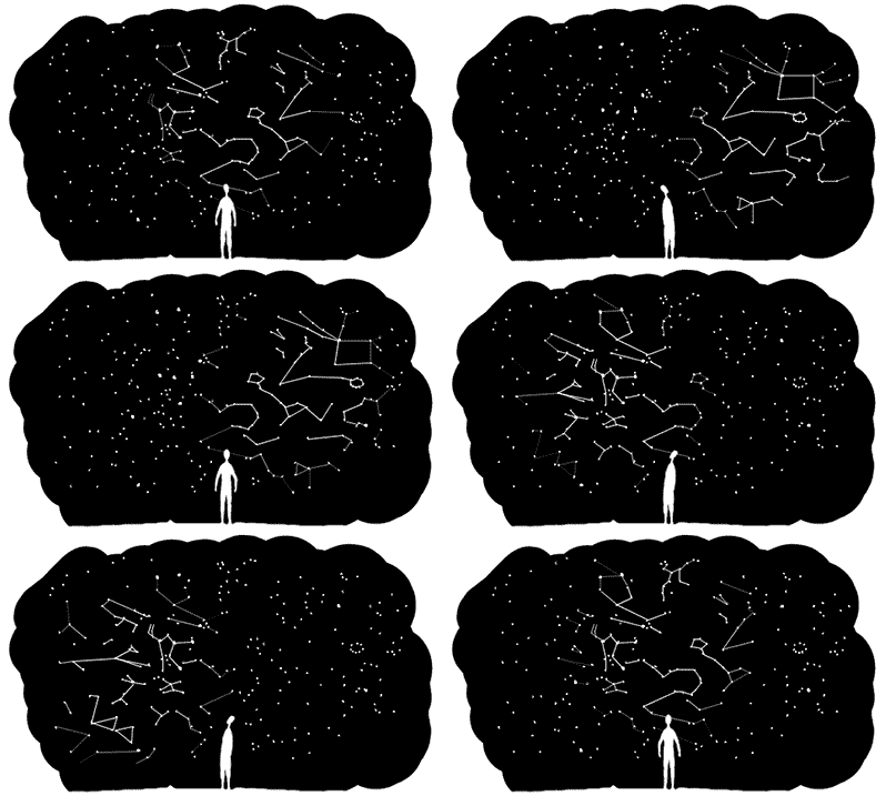
We try to see structure. Why? Because when we see structure, we can make predictions about what will happen next. We can also anticipate the consequences of our actions. To see structures — to connect the dots — is vital for our decision making.
So when someone looks at your design — let’s say a user interface — they need to understand the underlying structure in order to act. How do we design such a structure?
We create order.
We start by getting an overview of what we want to communicate. For instance if we design an exhibition, we gather everything we want to display, if we design a user interface we collect all the content we want people to have access to.

Next up we find a suitable order — or better yet: orders of these elements.
Organisational structure is something we impose on what we see. And there are numerous ways to order things. For instance linear structures are great when it comes to finding shoes of your size in a store, hierarchical structures help you navigate through the contents of a book or the collection of a museum. By tagging your favourite pictures you create a rhizomatic network structure. And even stories are some kind of order: Among all the weird events that occur in our lives we pick some — and ignore many others — to connect them in a linear fashion. This makes those events appear related in a logical causal way. We literally “make sense”.
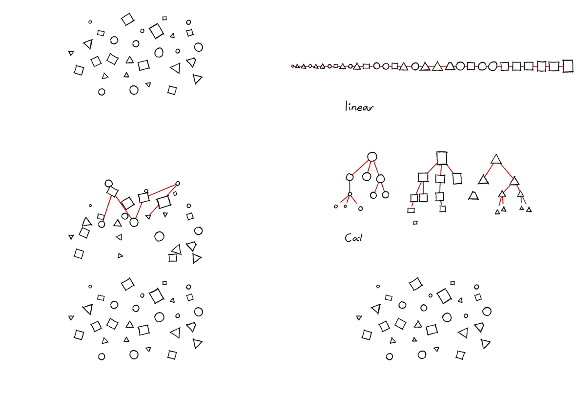
So how do we find the “right” order for our design task at hand? What kind of order we want to use depends on the people who use the information, their intentions and the situation they are in. It is part of our design process to pick suitable orders for the task at hand.
Then we show the structure.
To understand how we want to structure our content is one thing, but how do we help others to actually see it? We need to connect the structure with visual means of expression. For example in a text layout you might always use particular colours to indicate certain categories. Or you might arrange visual items — images, text and so forth — in a way that shows which parts belong together. Even the font weights of the headlines indicate the hierarchical structure of your text.

I know this sounds so obvious that you might wonder why I even bother to mention it. I do because a lot of interfaces, products, websites, exhibition guides, etc. lack this consistent semantic connection between content and form (and this is a basic design course after all).
Now that we have resolved the structure(s) of our components, let’s have a look at how those components change in time.
Step 2 — Process: What’s happening?
Nothing never happens. There is always something going on. Always! And we don’t just create static things, such as interfaces, objects or layouts. We design dynamic systems where people interact with those things. This is why it is so important to understand patterns in time.
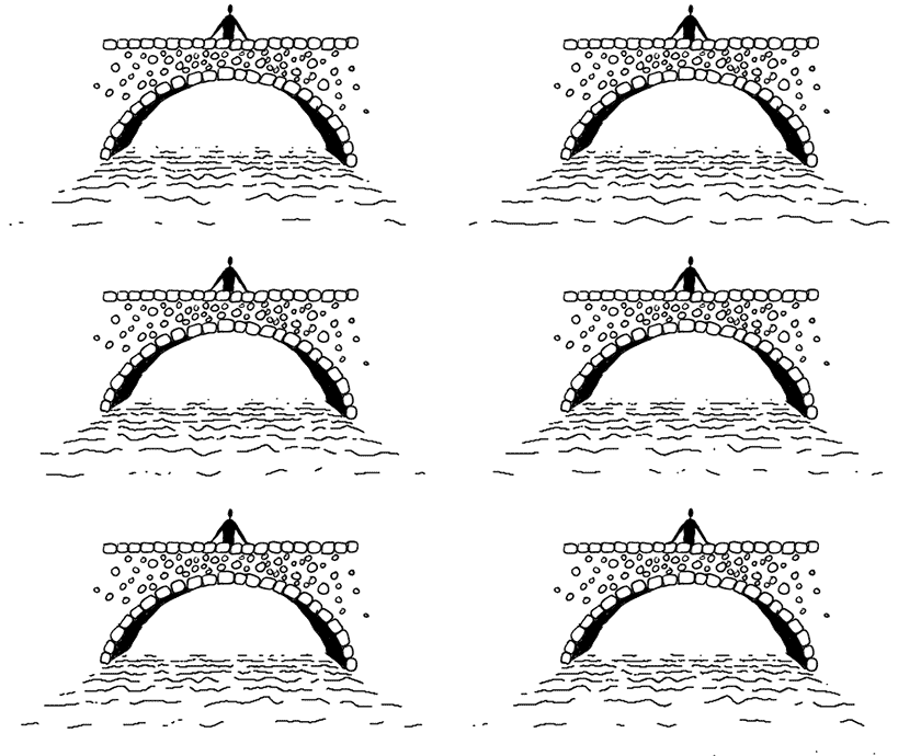
We need to sharpen our perception of processes.
Not all of them are instantly visible. Some are very slow, others very fast and yet others hidden from your view. We practise the perception of movement and change and understand how people interpret those dynamics.

We show process.

There are numerous methods — static and dynamic — to depict process. My personal favourites are storyboards and single images that show the essence of what is going on.
Step 3 — Designing an Interactive System
And there are plenty more: scenarios, experience journeys, wireframes, just to name a few. Whatever tool you choose, depicting process will foster your thinking in time, which of course is the foundation to design behaviour.
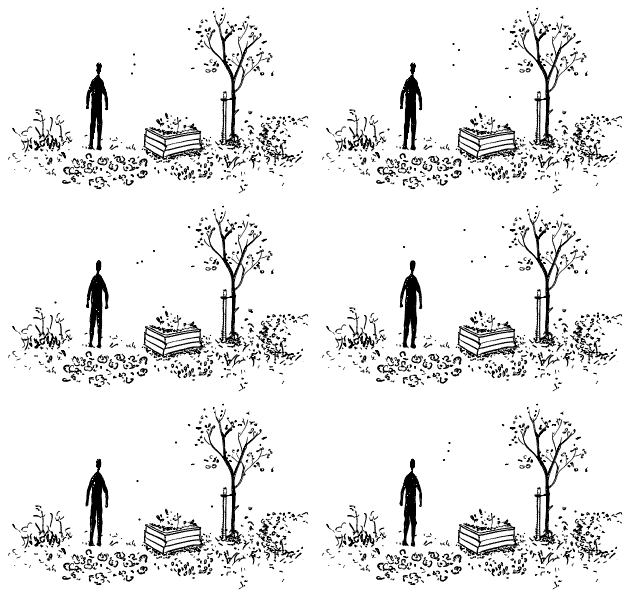
What do I mean when I speak of a system? I use this word to refer to a set of connected elements and their interplay.
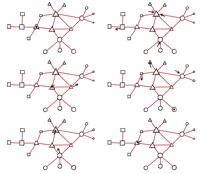
In the example of our garden all the living and non-living entities (animals, plants, mirco-organisms, stones, and so forth) are connected and influence each other. They form a system. The same is true for the blocks of programming code that form an application on your phone.
To design a system means to orchestrate the interplay of its elements.
Such a system is considered “interactive” if it is open, which means that there are ways to engage with the processes that are happening inside of it. There is of course a range of interactivities which spans from very basic reactive behaviour to highly complex conversational interactions.

For instance one might use interactivity to provide the audience with personalised information which spares them the bulk of irrelevant information — think of the difference between a digital and an analog dictionary. One might let people explore the content to let them — literally — grasp what is going on. And let us not forget the basic interaction between humans. Interactive systems can initiate social interaction as well. Just imagine an exhibition where people can experience and learn together.
So how do you come up with ideas for interactivity?
Among the plenty ways to find ideas for interactions I like to point out two: One is the problem solving approach. You explore the question “What do people need?”. This lays the groundwork for potential answers, which you then narrow down to the most promising solution. A second approach stems from the designers’ expert knowledge about the medium they use.

When I teach the basics of interaction design I encourage students to use paper as an interactive medium. Why paper? Because they can work with it intuitively. They can do so because they have already been experiencing the material for years. They might not be Origami masters (yet) but they have a basic understanding of the material. And it is this understanding of the medium that allows them to connect problems with suitable solutions.

As soon as they have an intuitive understanding for programming they might use code to come up with design solutions with digital media. Similarly regular gardening might help to gain a more intuitive understanding of biological systems.
Whatever interactive system you design, you connect a clear understanding of its purpose — won through structure and process — with an intuitive understanding of the materials you use.
Before you go
If you enjoyed this article, then subscribe to my mailing list to receive more animated stories!
Just came across the ted talk and then this page.
I am very interested in reading more of your posts
Thank you Ralph!
Although I didn’t understand it all, I think I get your main idea and I always love how you explain things in a simple, intuitive way. And your drawings and animations always help to make everything more intuitive.
I like very much your article “Don’t think big”, and I truly appreciate your beginners guides to drawing, which sometimes feels so intimidating for those like me who don’t feel any confident at drawing.
All the best from Venezuela.